How to choose a WordPress Theme smartly? Tips and Tricks

Everyone face the same problem: How to choose a WordPress Theme for a new or an existing website???

There are many factors that influence our decision. What should be taken in consideration and to what to pay attention find below: Tips and Tricks form Winithemes.com

1. What you need it for?

The days where WordPress was only good for traditional blog-like sites are long gone. Today, the platform is perfectly suitable to run any kind of site. And I do mean ANY. For instance, here are some of the possibilities, have a look at these different types of sites and a live example for each of them:

  • Video sites. Sites where videos are the core content.
    deTube WordPress Theme
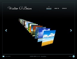
  • Photo blogs. Each day millions of photos are uploaded on web.
    PhotoArtist WordPress Theme
  • Magazine site. Like ReadWrite or Mashable, for example.
    OriginMag WordPress Theme
  • Commercial sites / business sites. Traditional business sites presenting the business’ products or services along with some side content.
    Creativo WordPress Theme
  • Traditional blogs. Well, we still have a lot of those.
    Postline WordPress Theme
  • One-product sites. Usually used to promote iOS and Android apps.
    Appify WordPress Theme
  • Business-card sites. One-page sites that only contain some contact data and a simple offer.
    Fusion WordPress Theme

The funny thing is that each type requires a slightly different design, as well as a slightly different core functionality. Therefore, when searching for a theme, make sure to use specific keywords. For example, if you need a magazine-styled theme, try using “magazine design.”

2. SEO-friendly

Search engine optimization has become such an important element in every website’s lifespan that selecting a theme with no SEO support is just a bad idea. Fortunately, if a theme is SEO-friendly, the theme creator will surely list it on the sales page. I’m only mentioning it here so you don’t forget to keep it in mind.

3. Up-to-date

A quality theme has to be up-to-date. However, this is a parameter that’s very often overlooked. The solution is simple. When looking for a theme, check the release date of the latest update. If it’s more than two years ago, don’t buy the theme and look for a more updated one.

4. Customizable

A situation where you can use a theme right out of the box rarely happens. You will always end up wanting to change the background or adjust the header image, etc. The rule of thumb is: The more customization features the theme has, the better.

5. Responsive structure

Having a theme with a responsive design is becoming a necessity nowadays. Basically, responsive design means that the theme looks equally as good on every mobile device as it does on a desktop computer. (Again, this is going to be listed on the sales page.)

6. Free documentation and support

Getting access to quality documentation and customer support is clearly an evidence of good service. Don’t ever get a theme that’s not supported by its author/creator.

Where to download WordPress themes from?

You can go to individual theme stores like Themify or Elegantthemes, sure. But an easier solution is to browse around here at Winithemes. That’s because we actually list more than 7,000 premium themes in our directory and they all come from a number of respected theme creators and stores … all in one place. Anyway, check it out for yourself. Just use the main search field and input whatever you wish there. We have one of the most powerful filters on the market (yeah, we’re that confident). Give it a try and start browsing now!

About the author: Karol K. (@carlosinho) is a freelance blogger and writer, passionate about entrepreneurship and using the internet as a business tool. He is founder of newInternetOrder.com, where he share various online business advice, with an additional rant every now and then.

Trends To Watch Out For In 2013

Trends are emerging every year and even faster. What to look for in 2013 read bellow:

Responsive Web Design

responsive-web-design

Responsive web design is by far one of the most emerging and discussed topic in the web design community. It is meant to define a similar visual representation of a web page and to facilitate web browsing across a broad range of screen sizes.

Responsive web design became very prominent when the mobile devices market and mobile web browsing met a tremendous popularity. The use of Internet is shifting fast to mobile devices, consequently websites are accessed via a lot more screen resolutions than before. According to recent statistics mobile browser usage increased to 14,55 % of all web activity, it is expected that in 2013 tablets will outsell notebooks for the first time ever and the total number of smartphones in use is 1,03 billion (Impressive, isn’t it? It’s around 15 % of World’s population).

Typography will take center stage.

typographyAs the last couple of years have seen the first breakthroughs in web type in a very long time, this combination will inevitably drive the increased usage of typography as the central element in website design. While there are things such as @font-face to serve fonts from the server, some of which are heavily weighted — the weight of fonts used for website design are often lighter than their image and script counterparts.

No Flash

flashIt’s highly evident that Flash is on its last leg. It’s bad for the SEO of a site, many mobile devices don’t support it (I’m looking at you, Apple), and it is a pain to update (it crashes my browser all the time, what about you?). Plus, there are so many other technologies out there that can do what Flash does now (i.e. HTML5/CSS3, JavaScript, etc.).

Retina Support

retinaRetina screens are basically twice as dense as any average LCD. So they are the same number of physical pixels, but digitally twice as many pixels can be fitted into the same physical space.

Fixed Header Bars

fixed barsUsing the CSS position: fixed; property is a great way to staple a header bar onto your website. As visitors scroll down your page this will offer constant support for navigation and a trip back to the home page. This trend has been around for a while but now we have it in full force.

Large Photo Backgrounds

Large Photo BackgroundsMore and more websites using large images as visuals on their home pages. It’s true that these large images make an impact, and companies know this. So, this trend will continue through at least the first half of 2013.

Minimalist Landing Pages

Minimalist Landing PagesCreating a landing page online is all about capturing new leads for your product or service. New trends are following the idea of minimalism: keep everything simple and focus on your core product.

More sharing on social networks.

Social Media BadgesLook for more social media integration into your favorite websites and even new websites. While sharing buttons at the end of articles is very old news.The use of deeper integration with social media networks on websites to explode in 2013.

King content will keep its importance

contentContent will keep its rightful throne as we move into designing for the web in 2013. Without content, there is no website.

Infinite Scrolling

infinite scorllingInfinite scroll loading has been around for at least a few years. But this technique hadn’t really hit mainstream until this year and I’m sure it will continue into 2013.

Sources of inspiration for this article were:

http://thenextweb.com/dd/2012/12/30/10-new-web-design-trends-you-can-expect-to-see-in-2013/11/

http://www.hongkiat.com/blog/web-design-trend-2013/

http://winithemes.com/blog/responsive-web-design-an-emerging-design-trend-for-2013/